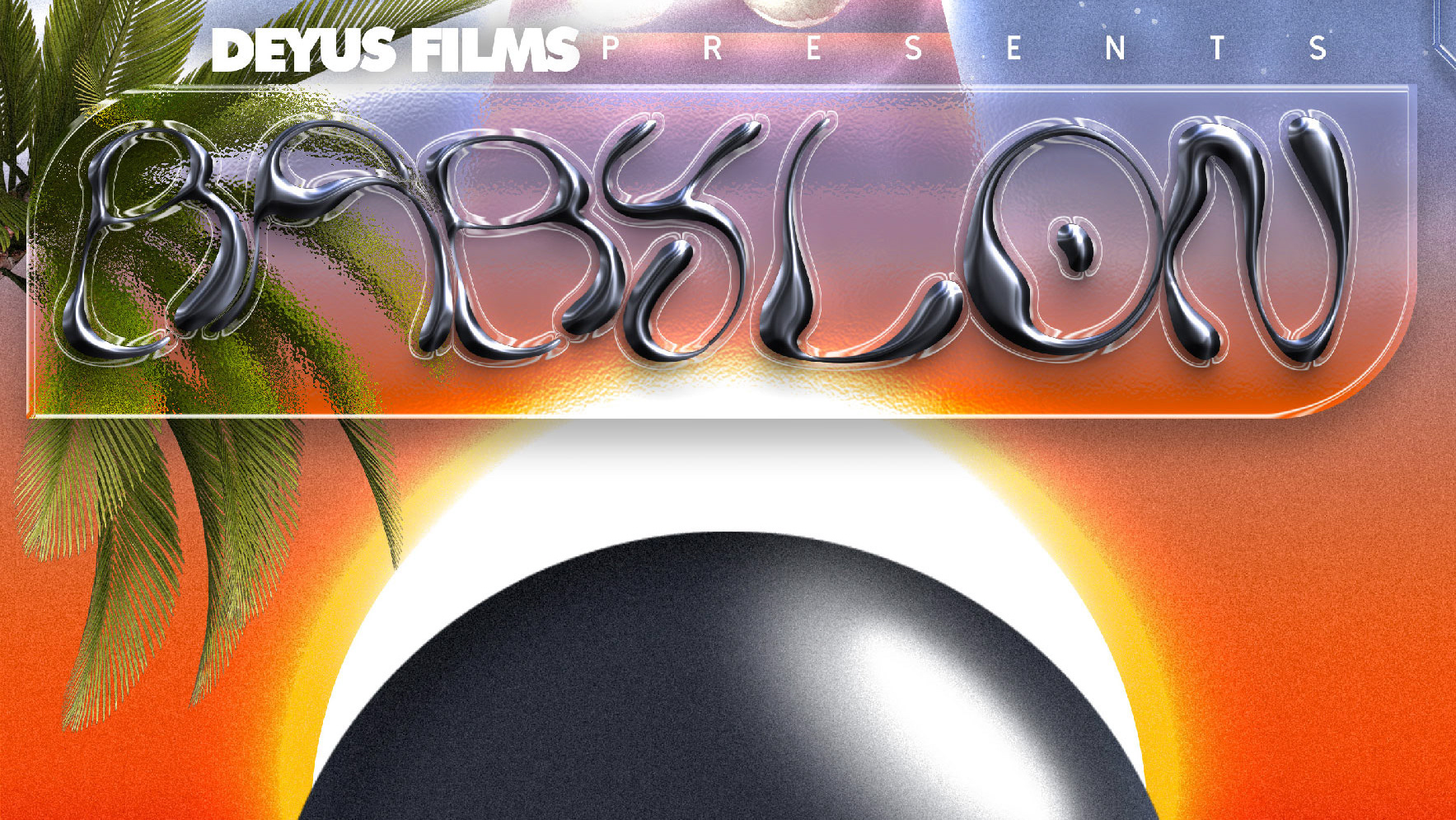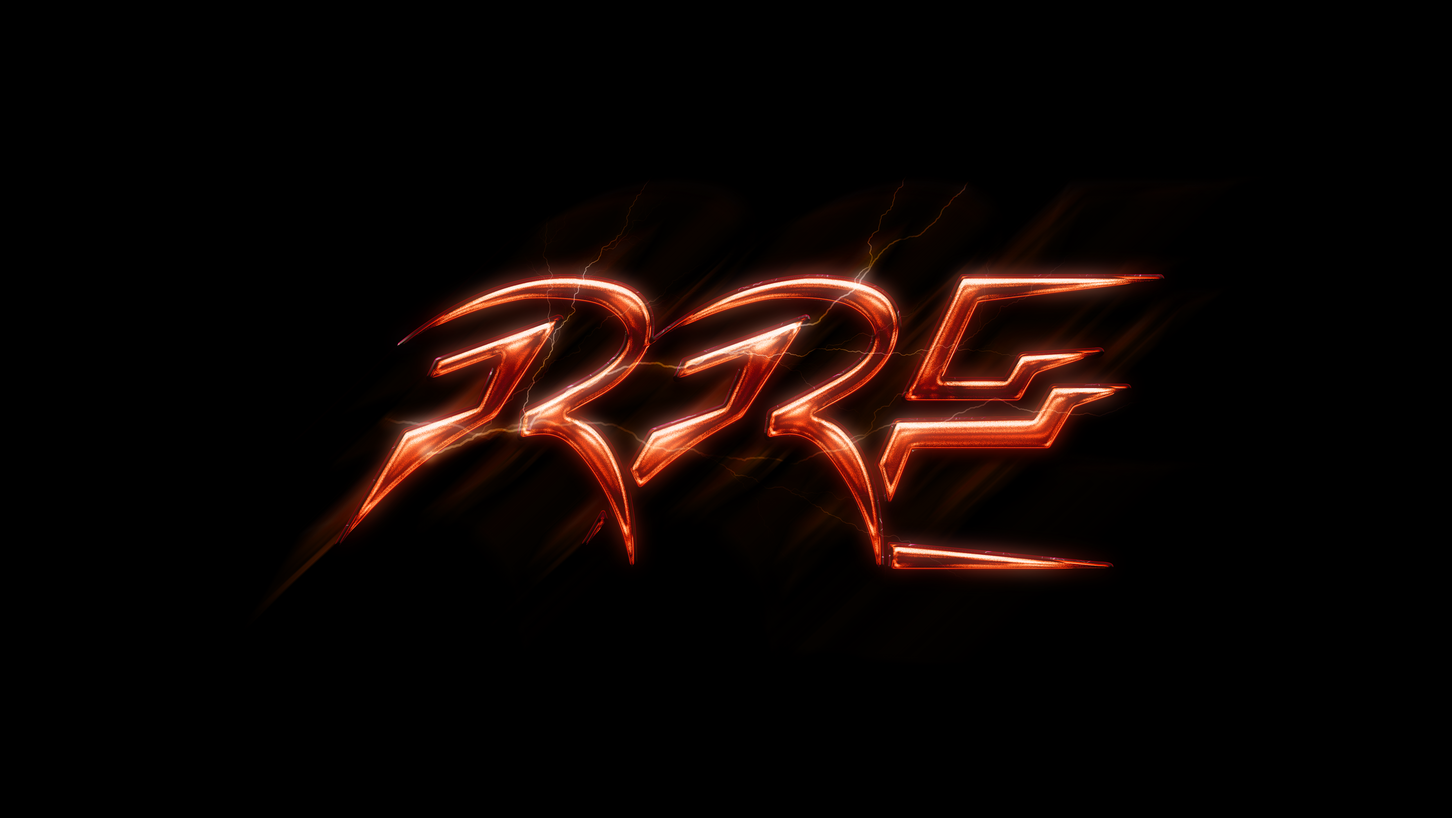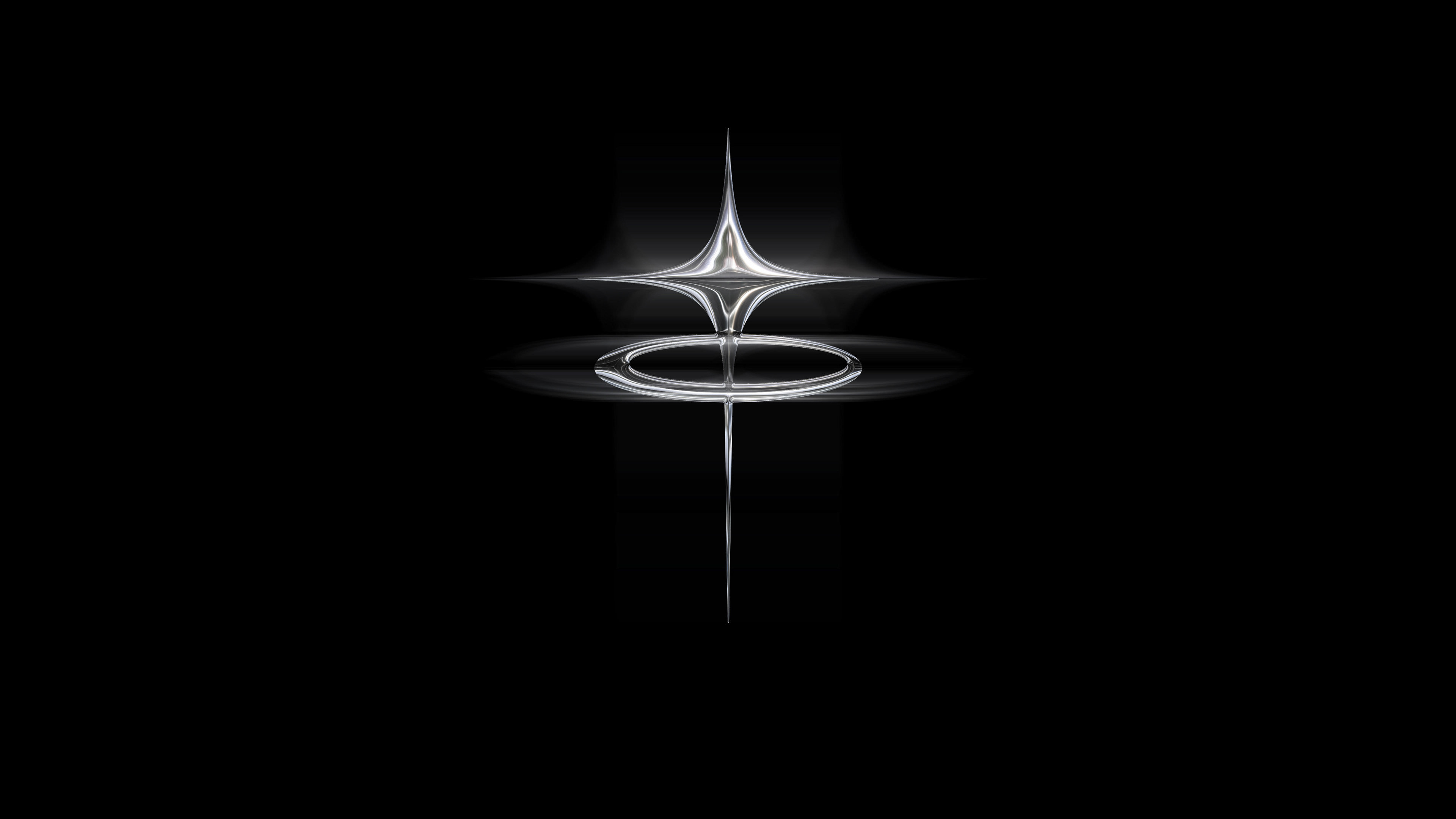

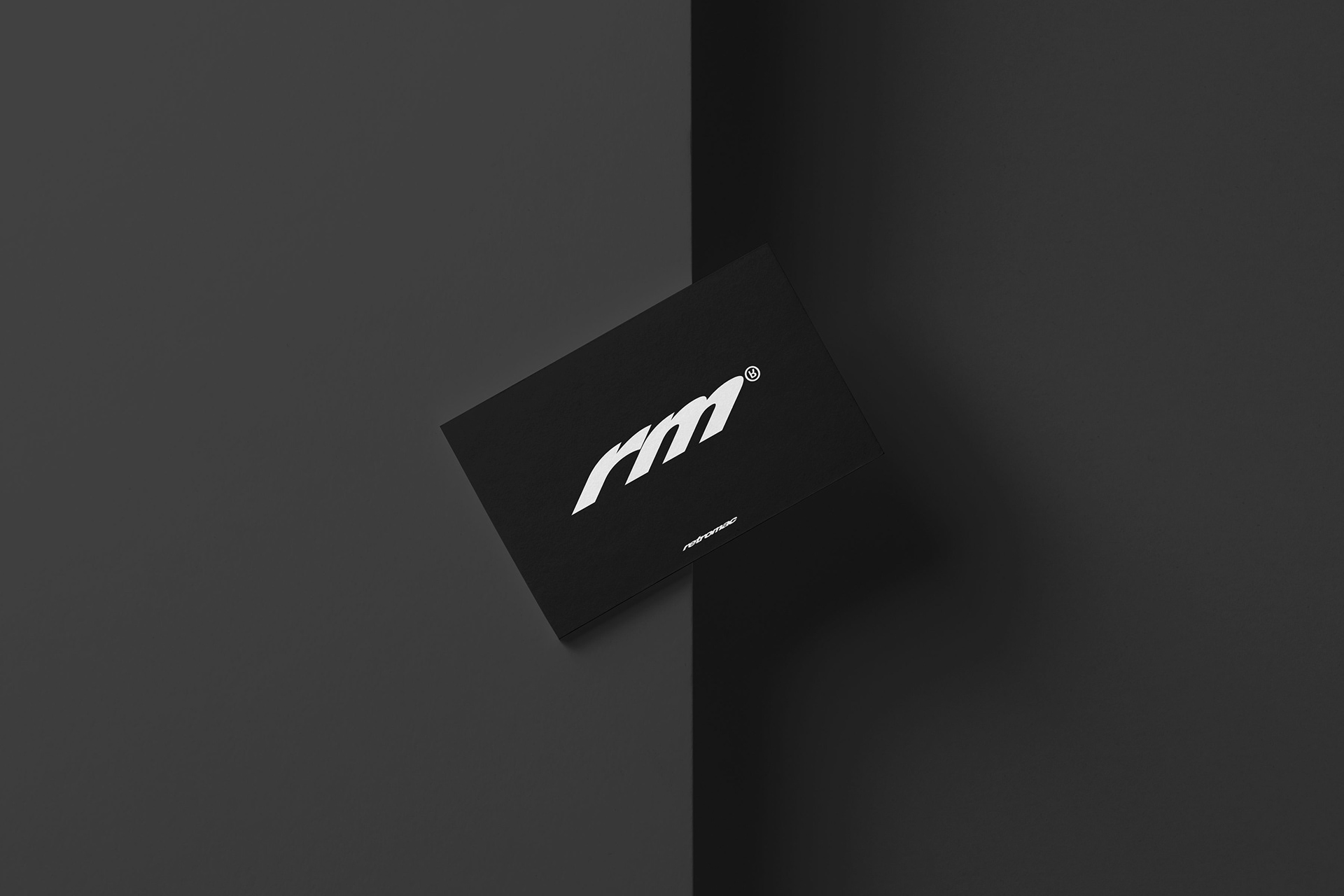
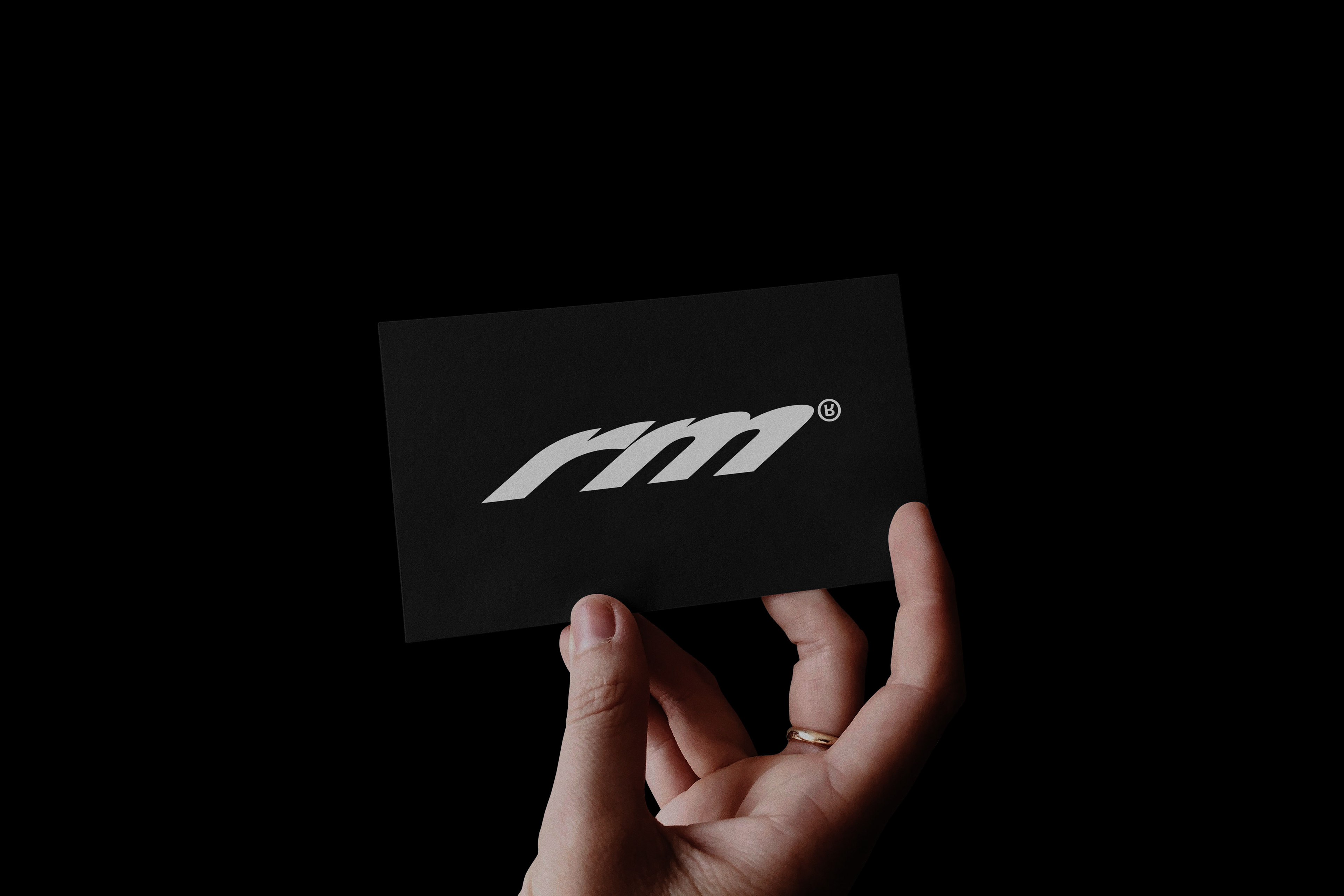
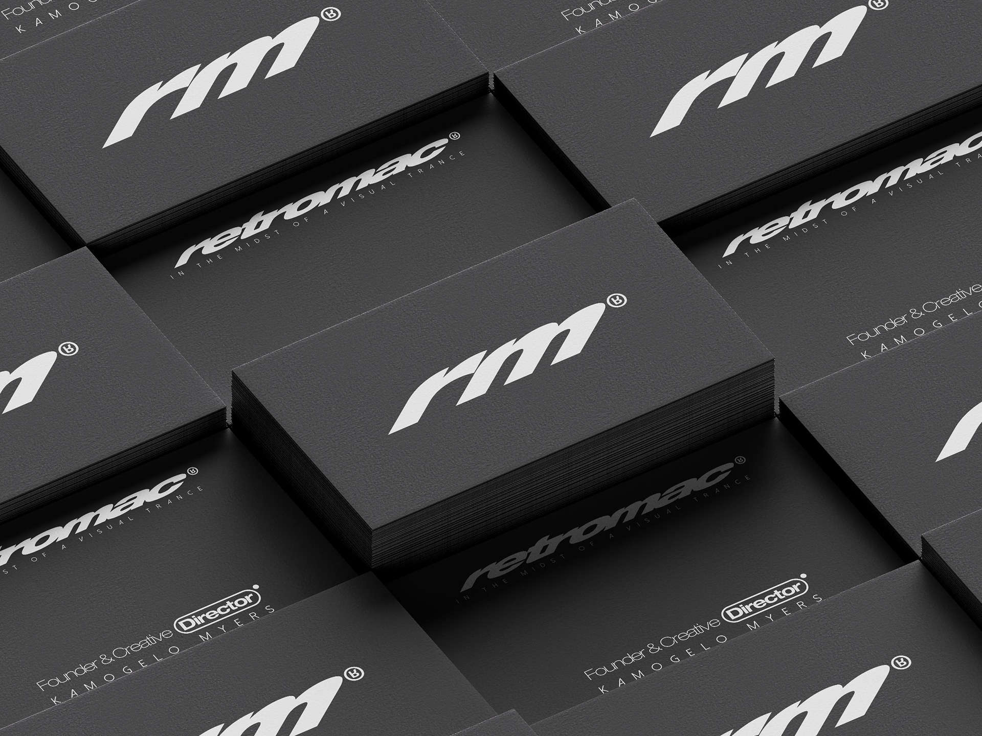
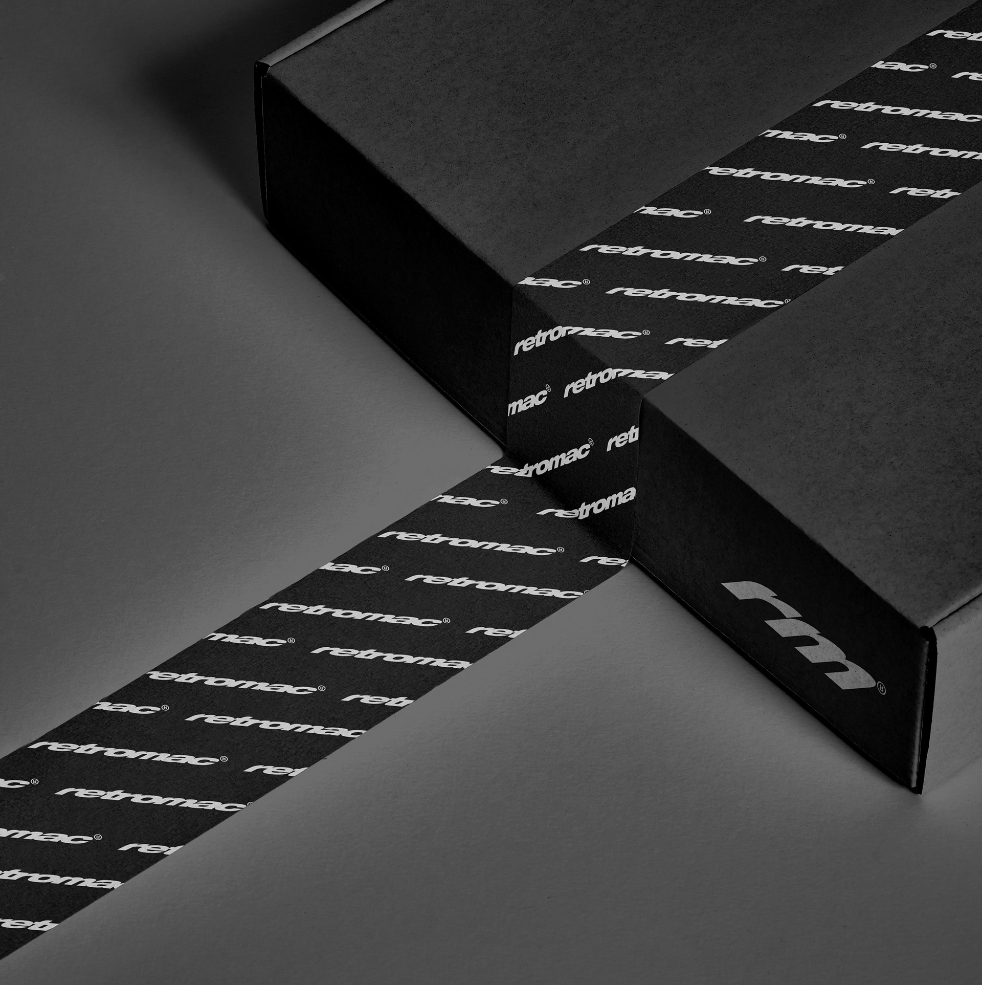
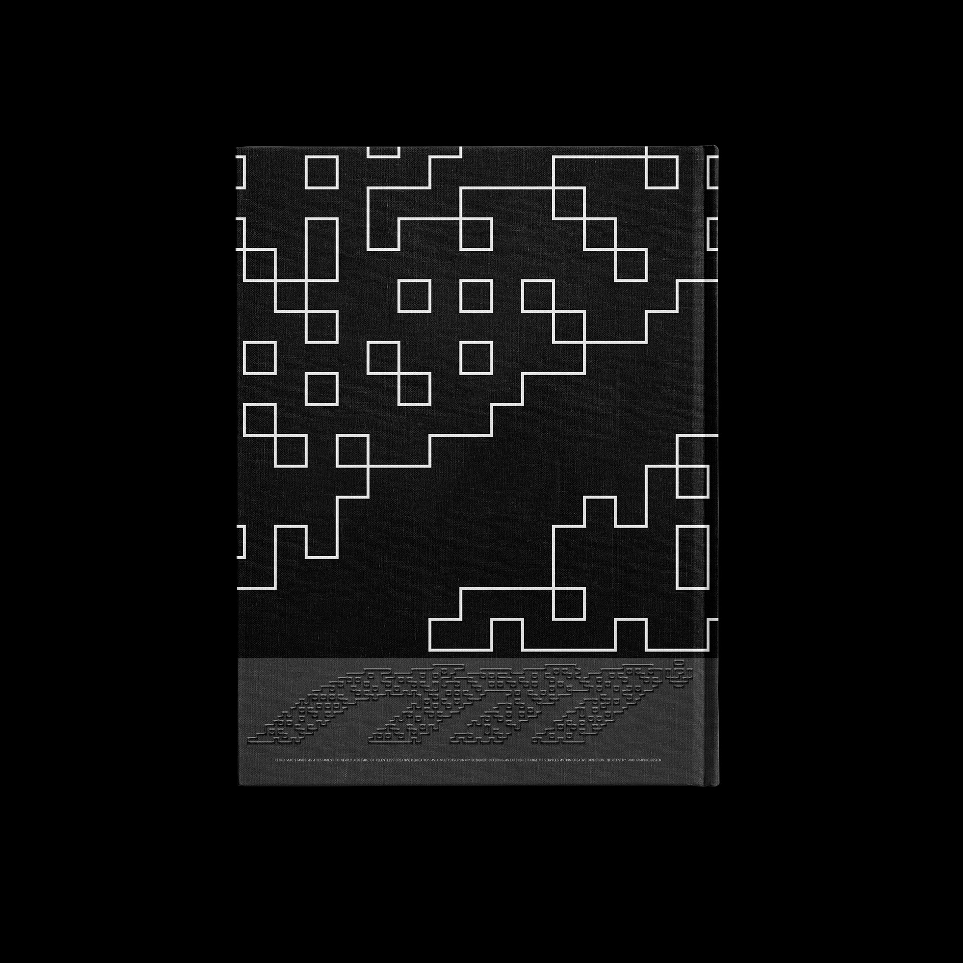
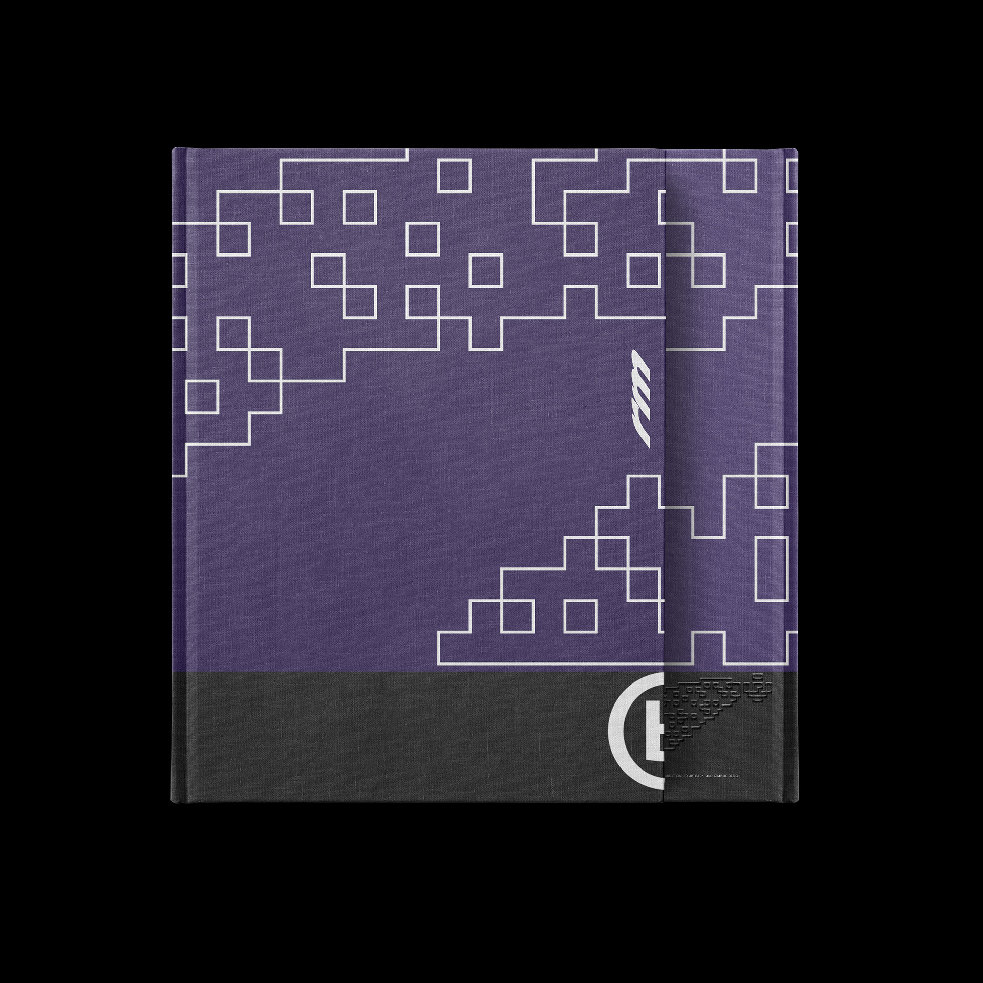
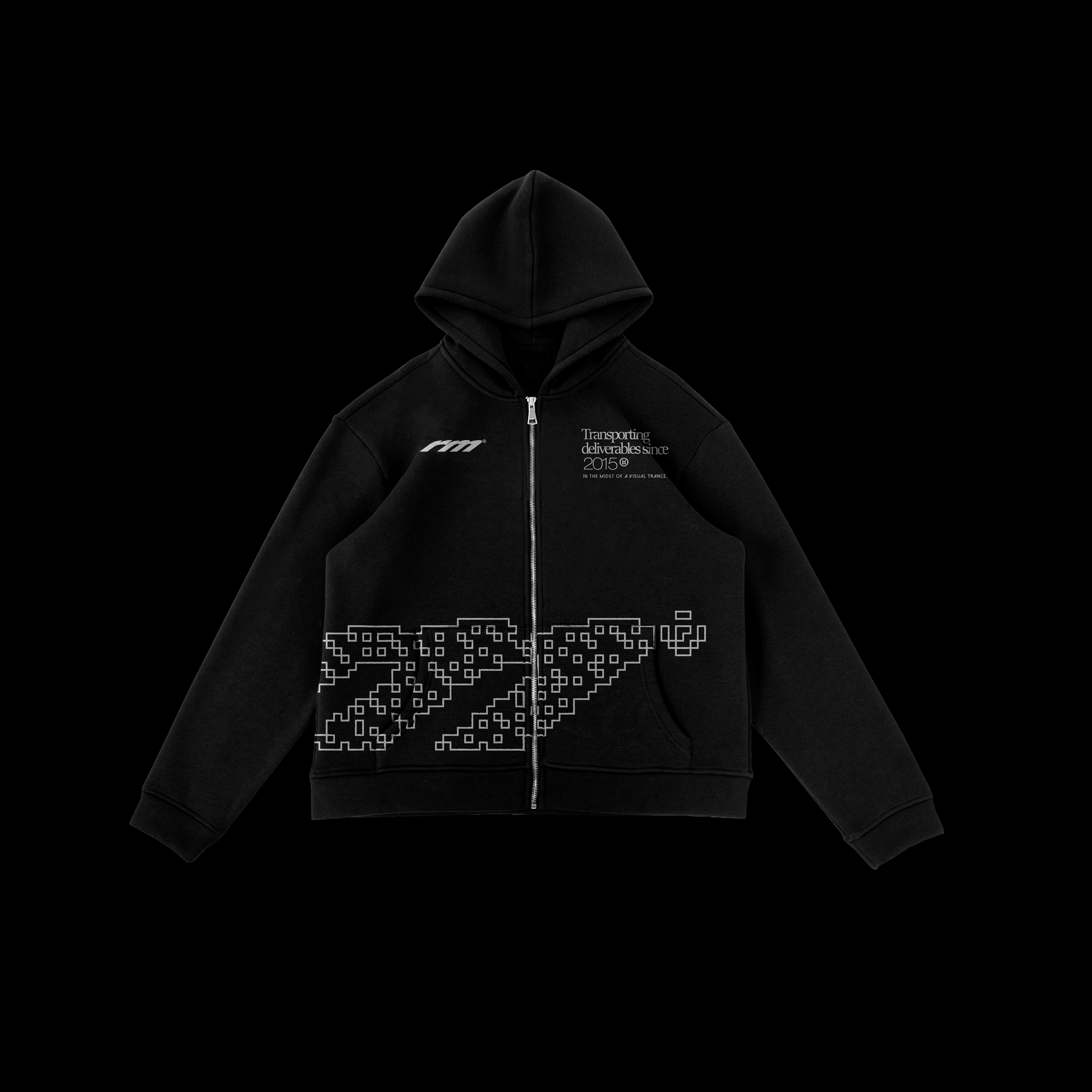
~This is an extensive display of my visual identity in exchange of my previous logo and logomark. Aiming for a much cleaner version that incorporates elements of curves and edges. Most of the top paths point towards an edge as if you were constructing edges of a roof plane and had to cut them to create a particular form. I believe this embodies my graphic ability to merge aesthetics of design to provide consolidation.
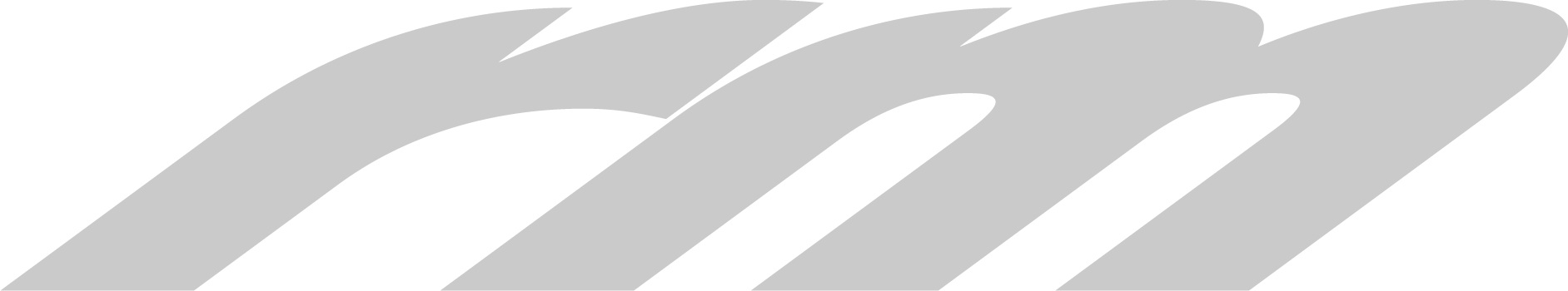
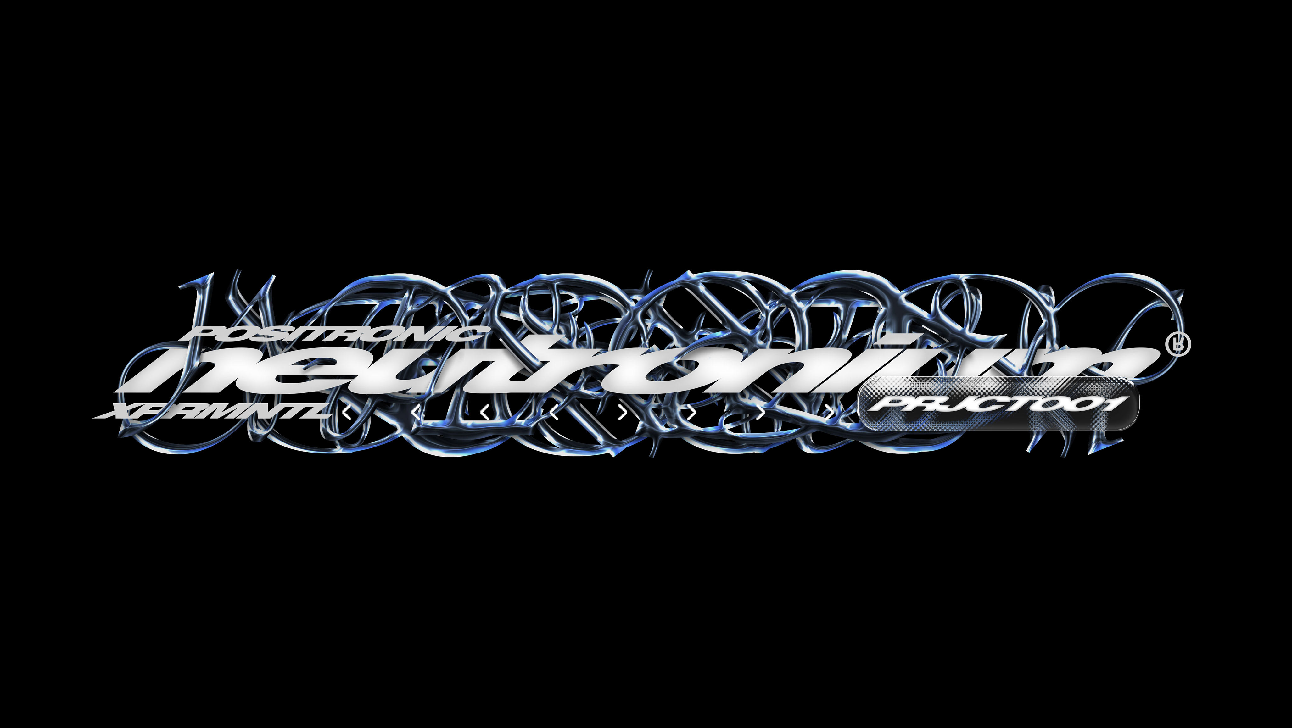
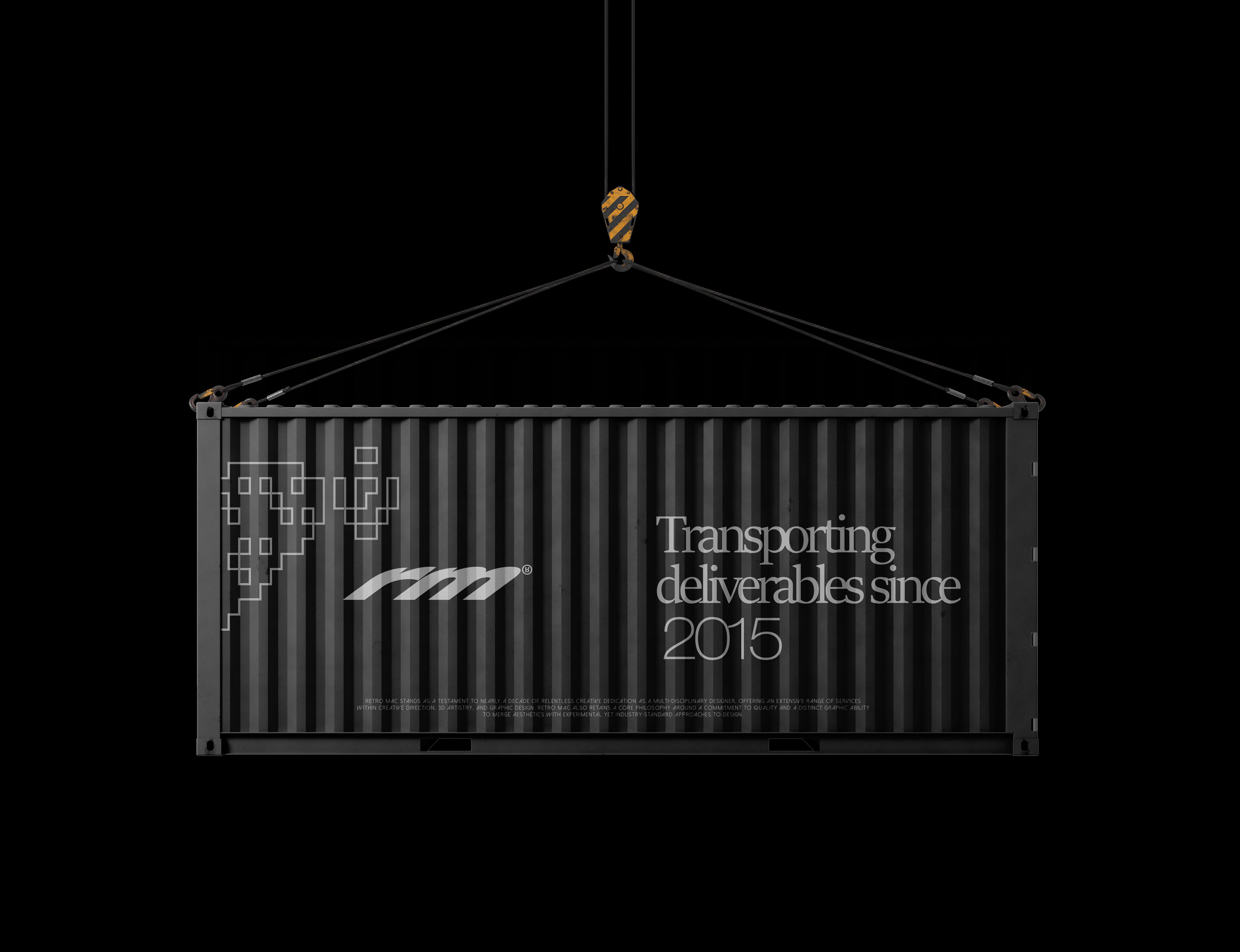
~More of how I seek to show irregularity integrated in my personal work is the usual of the upside down "R" or "Registered" symbol. This all plays towards a creative thought process that is unorthodox at it's very core.


RM® PERSONAL VISUAL IDENTITY
2022-2023
SOUTH AFRICA